
Blazorise 2.0 - Release Notes
When we released Blazorise 1.8, we promised that the next version would be a major one, 2.0.
Blazorise 2.0, codenamed Velebit after the majestic mountain range in Croatia, is a significant update that brings a host of new features, enhancements, and optimizations to the framework. This release focuses on improving the developer experience, enhancing performance, and expanding the capabilities of Blazorise components.
The codename Velebit represents the largest and most foundational step in Blazorise's evolution so far. Named after Croatia's most significant mountain range, it symbolizes strength, stability, and a solid backbone, qualities that define this major 2.0 release.
Blazorise 2.0 focuses on consistency over convenience, semantic APIs over ad-hoc options, and compile-time safety over runtime surprises. Many changes in this release remove long-standing inconsistencies to establish a stronger foundation for future features.
Key Blazorise 2.0 Highlights 💡
Below is an overview of the most important additions and changes in this release:
- Blazorise Migration CLI: a command-line tool to analyze, preview, and apply Blazorise 2.0 migration changes.
- Blazorise Analyzer: compile-time diagnostics that detect breaking changes and provide actionable upgrade guidance.
- MCP Server: AI-powered documentation and API access.
- .NET 6 and .NET 7: framework support has been removed.
- Unified Input API: all input components now follow the standard
Value,ValueChanged, andValueExpressionpattern for consistent data binding. - Renamed Input Components: components such as
TextEdit,DateEdit, andFileEdithave been renamed toTextInput,DateInput, andFileInput. - Extended Color Variants: expanded Background and TextColor utility options.
- FluentUI Theme Generator: dynamically generate and customize FluentUI themes.
- Autocomplete Validation Refactor: validation behavior is now aligned with other input components.
- Accessibility Improvements: enhancements across inputs, layouts, and providers.
- Tailwind CSS v4: upgraded to the latest major version.
Explore the sections below to learn more about each feature and how they elevate your Blazorise experience.
💡 Upgrading from 1.8.x?
Review the migration notes and use the Blazorise Migration CLI to ensure a smooth and safe upgrade.
👉 Migration guide: news/migration/200
👉 Migration CLI docs: docs/migration
👉 Analyzer docs: docs/analyzer
New Tools and Migration
Blazorise 2.0 introduces a number of small breaking and behavioral changes. Before diving into the details, it's important to highlight the new tooling designed specifically to make upgrading to 2.0 safer and more approachable.
To support a smooth transition, we strongly recommend using both the Blazorise Analyzer and the Blazorise Migration CLI when upgrading to Blazorise 2.0.
For teams that prefer or require a fully manual upgrade process, refer to the migration guide, which contains a comprehensive list of all API changes and behavioral differences introduced in 2.0.
Blazorise Analyzer
Blazorise.Analyzers is a new NuGet package designed to make upgrading and maintaining Blazorise projects safer, faster, and more predictable. Once installed, the analyzer inspects your Blazor projects at compile time and detects API inconsistencies introduced in version 2.0.
Instead of discovering breaking changes at runtime, developers receive immediate feedback directly in their IDE and build output. The analyzer reports clear, actionable compile-time warnings and errors when it detects renamed components, changed parameters, or usage of deprecated APIs.
Each diagnostic provides precise guidance on what has changed and how to update your code to the new API, significantly reducing guesswork during migration. This is especially valuable for larger codebases, where manual audits would otherwise be time-consuming and error-prone.
By shifting upgrade validation to compile time, Blazorise.Analyzers acts as a built-in upgrade assistant, helping teams adopt the new major version with confidence while keeping development workflows efficient and predictable.
For a complete upgrade experience, pair the analyzer diagnostics with the Migration CLI and review the migration notes for manual changes and behavioral differences.
Blazorise Migration CLI
The Blazorise Migration CLI is a command-line tool designed to upgrade existing Blazorise 1.x projects in a safe, reviewable, and predictable manner.
The migrator analyzes your solution or project, reports the required changes, and can apply them automatically when you are ready. All modifications can be previewed in advance using a dry-run mode, and optional backups ensure you can safely roll back if needed.
A recommended workflow is to:
- Analyze your solution
- Review the reported migration changes
- Preview file updates using
--dry-run - Apply the migration with backups enabled
For full usage instructions, examples, and available command options, see the Migration CLI documentation.
While the migrator automates many breaking changes, some updates require manual review. The migration notes document behavioral changes, removed APIs, and upgrade considerations that cannot be applied automatically.
MCP Server
An MCP (Model Context Protocol) server is now available to enable AI tools to access Blazorise documentation and code examples directly in a structured and up-to-date format.
Instead of relying on incomplete or outdated model knowledge, MCP-compatible clients can query the same documentation developers use, down to individual pages and example snippets, at the moment a question is asked.
For developers, this results in more accurate AI-assisted guidance, fewer hallucinated APIs, and answers that reflect the current state of the framework. As AI-assisted development becomes increasingly common, the MCP server helps ensure that Blazorise integrations remain reliable, trustworthy, and fully aligned with the official documentation.
New Features and Changes
Removed .NET 6 and .NET 7 Support ⚠️ Breaking
Support for .NET 6 and .NET 7 has been removed in Blazorise 2.0. Both frameworks have reached the end of their respective LTS and STS lifecycles, and continuing to support them would increasingly limit the evolution of the framework.
While it would have been possible to keep these targets for a little longer, they already constrained Blazorise to older APIs and prevented the adoption of newer Blazor and .NET capabilities. Maintaining compatibility with outdated frameworks would make future features significantly harder, or in some cases impossible, to implement.
Support for .NET 8 remains in place. However, once .NET 8 reaches the end of its LTS lifecycle (expected in late 2026), it will also be removed. From that point forward, Blazorise will target .NET 9 and later only.
This change unlocks access to the latest Blazor platform features and allows us to continue improving Blazorise with modern, performant, and future-proof capabilities.
Unified Input API ⚠️ Breaking
Blazorise 2.0 introduces a fully unified input API across all form components. Every input now consistently uses the standard Value, ValueChanged, and ValueExpression parameters, making data binding predictable and significantly simplifying form development.
This alignment removes long-standing inconsistencies between input components and enables more intuitive patterns when working with forms, validation, and custom inputs.
Before (1.8.x):
<TextEdit @bind-Text="" /> <DateEdit @bind-Date="" /> <Check @bind-Checked="" />
After (2.0):
<TextInput @bind-Value="" /> <DateInput @bind-Value="" /> <Check @bind-Value="" />
By standardizing how values are bound, Blazorise 2.0 makes forms easier to reason about, easier to refactor, and more consistent across the entire component library.
Heading Aliases
New component aliases are now available for both Heading and DisplayHeading, simplifying usage and improving markup readability.
You can use Heading1 through Heading6 as direct equivalents to <Heading Size="HeadingSize.Is1"> through <Heading Size="HeadingSize.Is6">, and DisplayHeading1 through DisplayHeading4 as equivalents to <DisplayHeading Size="DisplayHeadingSize.Is1"> through <DisplayHeading Size="DisplayHeadingSize.Is4">.
These aliases make it easier to write semantically clear headings without explicitly specifying size parameters, resulting in cleaner and more expressive markup.
Gutters Utilities
A new Gutter system allows you to control horizontal and vertical spacing between columns and rows directly on Row and Fields components.
The gutter behavior follows the Bootstrap 5 model and works consistently across all providers, including Bootstrap, Tailwind, and Bulma. Gutters can be applied per axis (OnX, OnY) or on both axes simultaneously, with full support for responsive values.
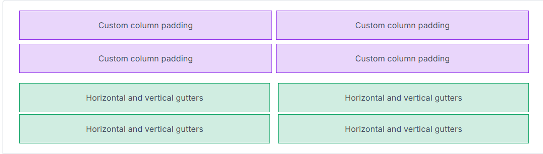
For more details and usage examples, see the official Gutters Utilities documentation.
Radio Component Updates
Radio components now use a simplified and unified binding model. The legacy Checked, CheckedChanged, and CheckedExpression APIs have been removed in favor of the standard Value, ValueChanged, and ValueExpression pattern.
RadioGroup<TValue> is now the primary binding surface, while each Radio<TValue> defines its option through the Value parameter. A radio is selected when its value matches the bound value of the group, resulting in cleaner markup, predictable value parsing, and consistent validation behavior.
Migration is straightforward: replace Checked* APIs with their Value* counterparts and ensure each radio defines an explicit option value. Standalone boolean radios are still supported but are discouraged in favor of grouped, value-based usage.
Before:
<RadioGroup TValue="string" @bind-Value="Selected">
    <Radio Checked="true">A</Radio>
    <Radio Checked="false">B</Radio>
</RadioGroup>
After:
<RadioGroup TValue="string" @bind-Value="Selected">
    <Radio Value="A">A</Radio>
    <Radio Value="B">B</Radio>
</RadioGroup>
This brings Radio components fully in line with the unified input model introduced across the framework, making them easier to reason about and more consistent with other form inputs.
Extended Color Variants
Color plays a key role in user interface design, conveying hierarchy, meaning, and accessibility. Extended color variants make it possible to fine-tune tones and introduce greater visual depth across your UI.
Enumerations such as Background and TextColor now support nested variants for subtle and emphasized shades. Previously limited to base colors like Background.Success or TextColor.Danger, you can now use variants such as Background.Success.Subtle or TextColor.Success.Emphasis. This aligns Blazorise utilities with modern design systems like Bootstrap 5.3 and FluentUI.
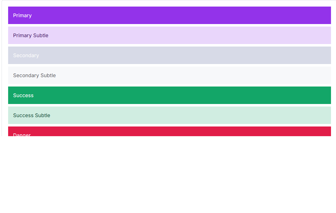
This system is powered by the IEnumerationNameBuilder infrastructure, which standardizes how enumeration values map to CSS class names across providers. For example, Bootstrap automatically generates classes such as bg-success-subtle or text-success-emphasis. The implementation is fully backward-compatible, ensuring a smooth upgrade path for existing applications.
You can explore the full range of extended color variants in the Colors documentation.
Badge Subtle
The Badge component has been enhanced with a new Subtle color mode. This introduces lighter, less saturated background tones, ideal for modern, minimalist interfaces or secondary indicators where softer emphasis is preferred.
By setting the Subtle parameter to true, badges automatically adopt muted color variants that blend naturally into the surrounding UI while maintaining clarity and readability. Subtle badges pair especially well with extended color variants, enabling more refined and theme-consistent designs.
Examples of subtle badges can be found in the updated Badge documentation.
FluentUI Theme Generator
The new FluentUI Theme Generator makes it easy to build and customize themes based on Microsoft's Fluent Design System. It allows quick configuration of colors, typography, and surface elements to create professional, cohesive Fluent-inspired interfaces.
The generator strikes a balance between flexibility and fidelity to the FluentUI aesthetic, giving developers control over visual customization while preserving consistent design principles across all Blazorise components.
Charts
Chart.js v4
Chart support has been fully updated to Chart.js v4, with significant improvements to how chart assets are managed and loaded.
All Chart.js–related static files are now handled and loaded dynamically by Blazorise. This means you no longer need to manually include <script> references, and any existing Chart.js scripts should be removed from App.razor, _Host.cshtml, or index.html.
The following script references are no longer required and should be removed:
<script src="https://cdnjs.cloudflare.com/ajax/libs/Chart.js/3.7.1/chart.min.js"></script>
<script src="https://cdn.jsdelivr.net/npm/luxon@1.28.1"></script>
<script src="https://cdn.jsdelivr.net/npm/chartjs-adapter-luxon@1.0.0"></script>
<script src="https://cdn.jsdelivr.net/npm/chartjs-plugin-streaming@2.0.0"></script>
<script src="https://cdn.jsdelivr.net/npm/chartjs-plugin-datalabels@2.0.0"></script>
<script src="https://cdn.jsdelivr.net/npm/chartjs-plugin-annotation@2.2.1"></script>
<script src="https://cdn.jsdelivr.net/npm/hammerjs@2.0.8"></script>
<script src="https://cdn.jsdelivr.net/npm/chartjs-plugin-zoom@2.2.0/dist/chartjs-plugin-zoom.min.js"></script>
In addition, all chart configuration options have been updated to align with the Chart.js 4.x API.
This change simplifies setup, reduces the risk of version mismatches, and ensures a more predictable charting experience across all hosting models.
Custom Named Axes
Charts now support custom named axes through the ChartScales configuration.
A new AdditionalAxes option allows you to define any number of extra axes in addition to the standard X and Y axes. This enables more advanced scenarios such as multiple value scales, mixed chart types, and fine-grained control over axis behavior and layout.
Validation
Revalidation Support
Revalidation has been a long-standing request. Previously, the complexity of input and validation internals made it difficult to safely introduce this capability. With the Input component APIs now significantly simplified, it became possible to extend the validation system in a more flexible and predictable way.
Manual revalidation allows you to explicitly re-run validation logic for inputs when your UI or business rules change. This makes it easier to fine-tune validation behavior and react to state changes that aren't directly triggered by user input.
Revalidation can be triggered on a single Validation component or applied in batch using the Validations component.
For usage details and examples, see the official Validation Component documentation.
Autocomplete Validation Refactor
Autocomplete now participates in the standard validation pipeline by inheriting from BaseInputComponent and no longer relies on its built-in validation wrapper. As a result, it behaves consistently with other input components and must be wrapped in a Validation component.
This change also resolves issues where validation errors were displayed on the search input instead of the overall control. In multiple selection mode, validation now operates on SelectedValues, SelectedValuesChanged, and SelectedValuesExpression, ensuring that selected items are validated as a single logical value.
To improve clarity, the MinLength parameter was renamed to MinSearchLength, reflecting that it applies to the search input length rather than data annotation validation.
RichTextEdit Validation Refactor
RichTextEdit has been updated to inherit from BaseInputComponent and now fully supports validation, bringing it in line with other input components.
The editor now uses Value / @bind-Value for HTML content, applies validation styling at the root level, and validates against the editor's plain-text representation. This ensures that visually empty content, such as a blank paragraph, is correctly treated as empty for validation purposes.
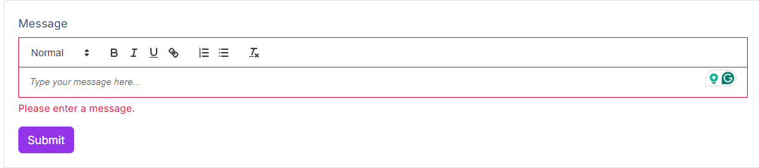
External Value updates are safely synchronized with Quill, while internal typing avoids unnecessary DOM re-renders that could disrupt caret positioning. Read-only behavior now correctly respects both ReadOnly and Disabled states.
Documentation and demos have been updated to use Value / @bind-Value, and a new RichTextEdit validation example has been added. Additional tests were introduced to cover validation behavior, including bUnit JS interop support and supporting test infrastructure.
Full Markdown Input Support
The Markdown editor now behaves like a first-class form input. It fully participates in form validation and displays validation feedback directly on the editor UI, allowing users to immediately see when the field is valid or contains errors.
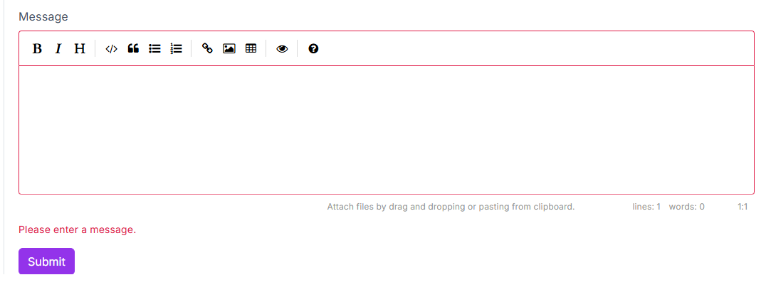
Common input behaviors are now applied to the editor surface itself. Read-only and disabled states behave as expected, custom CSS classes and styling are rendered where users see them, and additional HTML attributes are correctly propagated.
Focus handling has also been improved, ensuring reliable keyboard navigation and smoother form flows. Overall, the Markdown component now feels consistent with other Blazorise input components when used in real-world forms and validation scenarios.
Offcanvas Provider
Thanks to a contribution from community member Nex-Code, Blazorise now includes an OffcanvasProvider component that mirrors the structure and usage of the existing ModalProvider.
This provider enables consistent, centralized management of offcanvas components using the same patterns already familiar from modals.
A big thank-you to Nex-Code for their contribution and collaboration on this feature.
You can see it in action in the Offcanvas Provider documentation.
Modal Parameters Centralized
The Modal API has been refined by moving the Centered, Scrollable, and Size parameters from ModalContent to Modal.
ModalContent now derives these values from its parent and automatically refreshes its CSS classes when modal-level settings change. This ensures existing layouts and providers continue to render correctly while centralizing configuration at the modal level.
All internal usages, demo pages, and documentation examples have been updated to configure these options on Modal. The FluentUI2 modal implementation now relies directly on modal-level parameters.
To assist with migration, the analyzer has been extended to detect removed ModalContent parameters and guide users toward the corresponding Modal replacements.
Fluent Sizing Enhancements
Fluent sizing now supports viewport units and CSS variables, making it easy to express responsive widths and heights using Vw, Vh, and Var, alongside the existing Px, Rem, Em, and Ch helpers.
Minimum and maximum constraints can be chained directly on style-based sizing, including unit-only calls when you want to define limits without specifying a base size.
Inline style output is now cleaner and more consistent. Spacing between rules is handled at append time rather than through parsing, reducing overhead while keeping formatting predictable and stable across concatenations.
A dedicated Fluent Sizing documentation page has been added, with examples covering predefined sizes, style-based sizing, and CSS-variable-driven values. The page is also surfaced in navigation and search for easier discovery.
Intent-Based Coloring
A new Intent parameter is now available across components that previously accepted Color, providing a clearer, more semantic way to express intent such as primary, secondary, success, or danger, while remaining fully compatible with existing Color usage.
You can start using Intent immediately without changing current styles. Color.Link remains supported for backward compatibility but is now limited to button and alert components. Using it elsewhere will surface an IDE warning, helping you catch inconsistencies early while preserving existing behavior.
Tailwind 4 Upgrade
Blazorise.Tailwind has been upgraded to Tailwind CSS 4.0, adopting the new CSS-first engine and a modernized build pipeline based on the v4 entry format with @import, @utility, and @theme blocks.
The upgrade preserves the familiar Blazorise look while delivering faster, cleaner utility generation and more flexible, token-driven theming. Flowbite remains integrated for rich, prebuilt components.
If you maintain a custom Tailwind pipeline, this release is a good opportunity to align with the new entry file format and include the Blazorise build inputs so both your application utilities and Blazorise styles compile into a single output. Be sure your safelist is properly configured, Blazorise relies on some dynamically generated class names that Tailwind's content scanning may not detect automatically.
Bulma 1 Upgrade
The Blazorise.Bulma provider and demos have been updated to align with Bulma 1.0.4, bringing the styling baseline up to date and fully embracing Bulma's modern CSS variable system.
Vendor Sass imports were revised to include only the non-component utilities required by Blazorise, legacy utilities were trimmed, and class-provider mappings were adjusted so spacing and helper utilities reflect Bulma's updated naming conventions. These changes reduce custom overrides, improve compatibility with current Bulma behavior, and simplify future maintenance.
Theme generation has also shifted toward Bulma's native color palette logic rather than relying on hardcoded hover, active, and disabled values. Button states, tags, notifications, text helpers, inputs, background helpers, and borders now derive their colors directly from Bulma variables, while custom variants such as secondary continue to use explicit rules. Bulma-style palette and “on scheme” calculations are now applied so text colors follow the same contrast-driven behavior as the official Bulma theme.
Several layout and component issues uncovered during the upgrade were also resolved, including button group and dropdown borders and sizing, radio group alignment, and addon sizing in form demos. Breadcrumb active states now follow Bulma's active color logic, and navbar text contrast uses Bulma's invert variables to keep backgrounds and text visually balanced.
Overall, this upgrade results in a cleaner, more native Bulma integration that behaves as expected out of the box while preserving Blazorise-specific features and extensibility.
Typed Classes Customization & Per-Utility Targeting
Typed Classes and Styles maps are now available for complex components, allowing you to target wrapper and inner elements, such as Self, Wrapper, and Content, without relying on fragile CSS selectors.
Utility helpers have also been extended with per-utility targeting through OnSelf and OnWrapper, while UtilityTarget remains the default behavior. This makes it easier to apply spacing, sizing, and other utilities to the correct element, consistently across providers.
The Styling documentation has been expanded with clearer guidance, practical examples, including UtilityTarget usage, and a provider support matrix to help you understand which keys are available per component and provider configuration.
DataGrid Template Contexts
DataGrid template contexts have been updated to use dedicated context objects for SortDirectionTemplate, DisplayTemplate, EmptyCellTemplate, and DetailRowTemplate, replacing the previous approach of passing raw items or enums.
This change makes template APIs more consistent and exposes commonly needed metadata directly, rather than requiring custom lookups or fragile casts. Templates now receive the row item alongside useful details such as the column, row index, formatted display value, and sort state, all in one place.
The result is cleaner template code, less boilerplate, and greater flexibility when customizing DataGrid visuals.
DataGrid Grouping State and Change Notifications
The DataGrid now provides first-class support for grouping state persistence and grouping change notifications.
DataGridState<TItem> has been extended with ColumnGroupingStates, allowing grouped columns to be saved and restored together with the rest of the grid state. This enables reliable deep-linking and stateful UX scenarios where grouping must survive reloads or navigation.
In addition, a new GroupingChanged callback with DataGridGroupingChangedEventArgs<TItem> is raised whenever grouped columns are added or removed. The event includes both the current and previous grouping state, along with change metadata, making it straightforward to synchronize URLs, collect analytics, or manage parent-level state, without relying on render-cycle polling or workarounds.
LoadingIndicator Status
Blazorise.LoadingIndicator now supports status updates via a new SetStatus API, allowing you to push descriptive text and optional progress information through the service or component.
This enables the UI to reflect multi-step operations in real time, rather than showing a static loading indicator. The IndicatorTemplate now receives a LoadingIndicatorContext derived from the current status, making it easy to render custom messages and progress indicators alongside the spinner.
The existing API surface remains clean and flexible, supporting both local and application-wide loading indicators while enabling richer, more informative loading experiences.
Accessibility Improvements Across Inputs, Layouts, and Providers
Accessibility support has been expanded across Blazorise without breaking existing APIs by applying consistent ARIA semantics to core input components across all providers and extensions.
Input components now expose typed AriaInvalid and AriaDescribedBy parameters. When these are not explicitly set, the framework automatically derives appropriate ARIA attributes from validation state and field help metadata. This ensures screen readers can reliably announce validation errors and descriptive help text, while still allowing advanced users to override ARIA behavior when needed.
Autocomplete and rich text / markdown inputs now propagate these ARIA attributes to their primary interactive surfaces. The behavior is aligned across all supported providers, including Bootstrap, Bootstrap5, Bulma, AntDesign, FluentUI2, Material, and Tailwind.
Beyond inputs, interactive non-input components have also been aligned with ARIA expectations across providers. Accordions, dropdowns, modals, offcanvas panels, tabs, pagination, toasts, alerts, and validation messages now emit consistent aria-expanded and aria-controls attributes, dialog labeling, live region behavior, and role metadata.
The result is a stronger accessibility baseline out of the box, improved keyboard and assistive technology behavior, fewer manual ARIA adjustments in application code, and a consistent experience regardless of the chosen UI provider.
Final Notes 🏁
Blazorise 2.0 delivers a more consistent and modern foundation, with a unified input system and simplified APIs that make form handling clearer, more predictable, and easier to extend.
As you upgrade, take time to review your input components and update bindings where needed. Doing so will ensure a smooth migration and allow you to fully benefit from the improvements introduced in this major release.
